| |||||||||
|
|
||||||||
It undoubtedly depends on what one means by "effective." To me, it means you can find what you're looking for easily and quickly, though it seems a lot of recent websites - again, not necessarily automotive ones - are trying too hard to titillate surfers' eyes, in the process forgetting to make the sites easy to use.
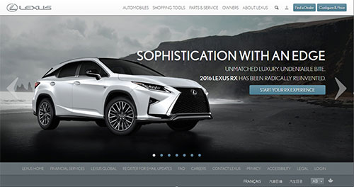
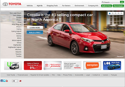
Take two sites from the same overall company: Lexus and Toyota Canada. Toyota's is a more "old style" site with the models and the voluminous information about them easy to find via menus. Lexus redesigned their site a while back to follow the current trend of offering big pictures and lots of side to side scrolling, but less information easily at hand - and if you want to find the detailed specifications about a particular model, then you have to download an Acrobat file rather than just take a look at them on the site itself.
This is just one example and it isn't really fair to focus on Toyota/Lexus because they're merely representative of the species. But that said, as a fan of both brands as well as a kind of techocurmudgeon, I'd rather surf the Toyota site than the Lexus one because, while it may not be as pretty or dazzling, it's a more rewarding surf for me, when I'm researching a vehicle (something that in this biz I do all the time for research), because I don't have to mess around with trying to figure out where stuff is.
 These are just my opinions, of course, and I often find myself barking in the wilderness. This appears to true here, too, because the J. D. Power survey's respondents judged the Lexus site tied for the top position (with Lincoln, whose site is, to me, better). Both websites earned a score of 782 out of a possible 1000. Cadillac came in third (781), followed by Infiniti (779) and Jeep (775). I don't really find any of the sites particularly compelling, however. Obviously, I wasn't surveyed!
The study looked at four key features of the site in question: information/content, appearance, navigation and speed. It found that nearly two-thirds (63 percent) of new-vehicle shoppers who claimed a positive online experience said they're more likely to test drive a vehicle after visiting the manufacturer's website, compared to less than a quarter (21 percent) of those who were "disappointed" with their website experience. I imagine this would be pretty similar to any retailers' website, whether for cars, electronics, whatever.
My advice to web developers (of which I used to be one, many moons ago when we all used text editors): remember the KISS principle - the ol' Keep It Simple, Stupid! Just because you have this nifty web technology doesn't mean you need to use it, especially if it's going to go against the purpose of the site (disseminating information and, hopefully, facilitating sales).
It's like back when Flash animation became popular and websites starting using these Flash "landing pages" that slowed down your accessing of what's behind the entry page (if the Flash plugin would even work). It got to the point where I'd just head out again when one of these "gee whiz, look at how much money we spent on Flash!" would rear its ugly head.
Many of these new, graphics intensive sites seem to be going the same way, replacing easy functionality with "flash," whether it's actual Adobe Flash or not. In other words, they're opting for form over function. Do these people in charge not think?
Extensive graphics also means more bandwidth, at least to a certain extent, compared with simpler, more text-based ones. Sure, they can be quite pretty, but they could also use more of the consumer's precious data plan if viewed on a mobile device. And if you're doing to snag - and keep - potential customers' eyes, you need to keep the loading times down, especially if you're throwing up roadblocks to accessing info.
"There is a correlation between speed and navigation, as automaker websites tend to perform similarly in speed and navigation site satisfaction," said Ney. "Websites that achieve high satisfaction scores in speed generally also achieve high scores in navigation. Of course, the flip side is also true: low navigation satisfaction scores also tend to correlate with low satisfaction in the speed measure."
It must be a pretty thankless gig designing a website these days because you have to balance different types of sites for different users on different devices. According to J. D. Power, "providing a positive website experience is growing increasingly more complicated as the percentage of vehicle shoppers using mobile devices to access manufacturer websites increases to 46 percent in 2015 from 41 percent in 2014. Mobile devices users find the website experience less satisfying than do desktop shoppers overall."
Well, duh! If your visitor can't find what he/she/it's looking for, the site has failed.
I can understand the challenges between offering a compelling site for mobile and computer-based users; I've faced it myself. It's tough designing a site that works at different resolutions and orientations, believe me! Some places (not necessarily car sites) get around this challenge by offering a scaled down mobile site and a link to the full site, which can be a reasonable solution, though it might not work in every instance.
J. D. Power also noted that shoppers have different expectations for their website experience when on a mobile device than when on a desktop computer. "While information/content is most important to shoppers regardless of how they access a site," the company said, "speed is more important to mobile users than desktop users, while navigation and appearance are more important to desktop users than mobile users."
The study is based on responses from 3,380 new-vehicle shoppers who indicate they will be in the market for a new vehicle within the next two years. The study was done between February 10 and March 7, 2016.
For more information about J. D. Power's 2016 Canadian Manufacturer Website Evaluation Study, visit their website.
The bottom line to me is that however you're designing your website - car company or just a personal blog - the idea is to get across information. If it can be attractive and entertaining, great! But the information is why folks visit your site, so concentrate on that.
Copyright 2016 Jim Bray
TechnoFile.com
Jim Bray is a member of the Automobile Journalists Association of Canada. His columns are available through the TechnoFile Syndicate.
Reviews by Brand |